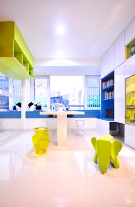
A studio apartment designed by Hue D, situated in a prime district of Singapore, has reached the shortlist for the Residential Property Asia / Oceania Award.
Design brief: The apartment has 2 rooms and a kitchen integrated with the living space, with views out towards the Mercedes Benz and BMW showroom buildings, which are fine architectural pieces in their own rights.
The Client had a long list of requirements: a larger kitchen, a dining area, a living space and a working area. Additional requirements included storage facilities for a collection of clothes and fashion accessories, display units for many collectable toys, housing for a cat, and much more!
In order to carve useful spaces out within the small area, studies has to be done on the plan and the sections of the interior spaces rigorously.
In addition to the functional aspects to be met, we were also aware of the Client’s wish to live stylishly. Our proposal was therefore to create an interior reminiscent of a ’boutique’ hotel. The apartment had to look modern, inviting, fun and maybe even a little funky.
Favourite / key aspect of the project: Throughout the apartment, we created full length and height cabinetry for a TV, entertainment consoles and many other items so that most of the clutter could be kept away inside concealed doors. Reflective white surfaces are used on the facade of these cabinets to make the space look brighter and larger.
 After this was done, we carved out recesses to house the display items: the TV, library of CDs and collectable toys. A retro funky sofa, ‘slotted’ under a row of cabinets, was cladded in mirror. The same row of tall cabinets also neatly hide the housing for the client’s pet cat.
These recesses were then cladded or painted in bursting colours of lime green, metallic blue and luminous pink. These ‘dabbings’ on the white canvas with burst of colours create a hip visual factor while making the space look bigger than it really is.
An exception to this rule is a volume of book cabinets in lime green that juts out high from a wall near the windows. This allows a person to sit below it to use the study table. A mirror is positioned under the suspended cabinet to give it a ‘floating’ illusion, as well as to make the study space look wider. Customised sliding screens with small hexagons were designed and put in place to prevent the cat from jumping through the external windows. While functional, this adds another layer of visual interest to the interiors.
The original kitchen already has a small hood and hob, but the client finds it impractical. Thus we added a ‘new’ wing to the existing kitchen, with new Bosch ceiling mounted hood and full functioned hobs.
An ‘extendable’ table from Franc Franc is positioned beside this new kitchen ‘wing’, to take full advantage of the proximity for quick serving of food. A Louis Poulsen LC Shutters lamp is positioned above the table, creating a soft and gentle ambience for a private dining experience. Philippe Starck La Boheme chairs in various hues can be used at both the dining and study tables. They can also be used as coffee tables in the living space when necessary. The client also brought in an Eames Elephant as a visual marker.
In the master room, we designed a headboard for the bed in a similar design language. Pockets of hues contrast with the reflective white cabinets and can be used for displays. The rest of the headboard is used for concealed storage. The two vertical sides of the headboard are slanted inwards, so that there can be more space for maintenance on the bay-window. This detailing also gives the headboard a ‘paper-thin’ look as the width of it cannot be seen at most angles where you look at the headboard. A pair of green Ferruccio Laviani bedside lamps anchor the look.
The client required so much storage for apparel and other fashion accessories that we decided to make a bold design statement for the wardrobes and perhaps to derive a new typology for wardrobe. Typically, wardrobes are designed as a single item, a single volume. For this project, we decide to ‘break’ this single volume down into different parts.
 These parts are expressed as different volumes, much like storage chests, stacked neatly one above another or placed side by side. The result is an original and striking ‘collage’ that somewhat resembles an art installation of storage trunks or a funky fashion boutique or something in between.
Why does the design work so well? The client is receptive to new ideas and design. It also helps when we make sure that the design, function and aesthetics come in hand in hand together without compromising one another. This gives the project an additional layer of meaning.
View more of HUE D’s work here: www.hue-d.com.sg
Find out more about The International Design and Architecture Awards here: www.design-et-al.co.uk
